Sure, you can download free fonts all over the web but don’t make that mistake without looking here first. This should be the top place to look for every project!

Support Wellfed – This platform is made possible by your support. If you enjoy any of our content, please consider joining one of our Patreon memberships here.
As a graphic designer your job is to create visual solutions that fit perfectly for the problem at hand. This can come down to details such as using certain colors, imagery, and my favorite of all, fonts. There are so many different places to search for fonts out there that it can be difficult to know where to look. Another problem that I have found is that not all free fonts are created equal. There is the age old saying “Just because it’s free, doesn’t mean it’s good” and this still very much applies to free fonts as well.
My number 1 place to download free high-quality fonts is Google Fonts. Google Fonts offers 900+ free fonts for graphic designers to use in any commercial or non-commercial project. The Google Fonts website is an interactive directory that allows you to search for whatever font you need using a ton of different properties such as style, width, height, and more. I also want to make sure that I mention Google Fonts makes it easy for you to use their fonts on any web project you have.
In the rest of this article I’ll go over what makes a good free font, the various categories, how to download fonts from google fonts, and some of my favorites I think you should know and master. Make sure you read till the end of the article for my favorite fonts in each category and a free font pairing cheatsheet.
Problems with Free Fonts
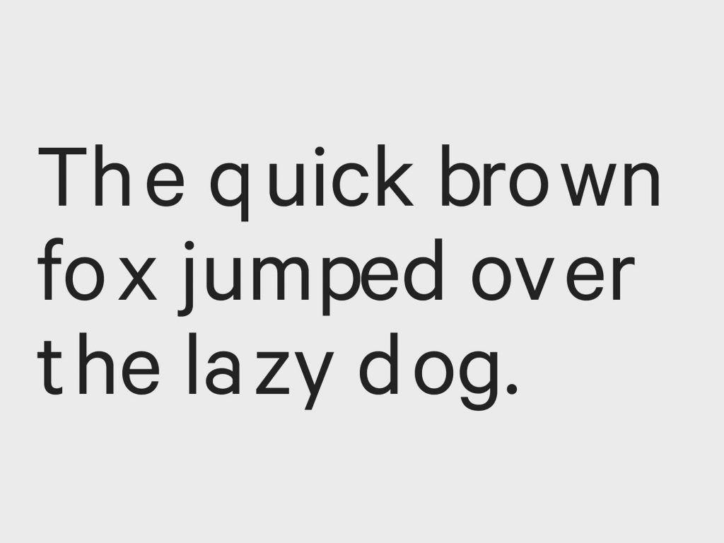
If you search long enough you can find all kinds of websites that offer free font downloads. I know from experience and I have downloaded my fair share of free fonts over my career as a graphic designer. The saying “Just because it’s free, doesn’t mean it’s good” can certainly ring true for most free font downloads. There are a few problems that I have encountered after downloading free fonts and they are usually:
- Incomplete or missing character sets
- Inaccurate letter spacing
- No commercial license offered
These 3 things can really put you at a disadvantage as a graphic designer especially when you are starting off. We all know, time is money and money is time. If you have to waste time fixing 1 or 2 of these points then you might as well have spent money purchasing a font instead.
What Makes a Good Free Font?
When looking for free fonts you want to make sure you cover each of the 3 points that I mentioned. The font includes a full character set, has appropriate letter spacing for each character, and offers a personal-use and commercial-use license.
Full Character Set
Making sure your font download includes a full character set is definitely important for any free font. You never want to be in a situation during a project where you are missing some punctuation, numbers, or even worse, a letter! This will definitely hurt your credibility as a professional who is supposed to be an expert when it comes to this.
Consistent Letter Spacing
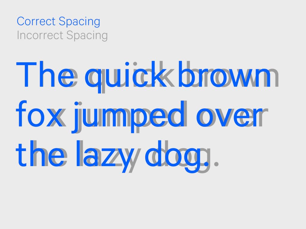
When it comes to fonts, it is not just about how each letter looks independently but how they look collectively while in use. This means that the spacing between each letter when using the font should not have any inconsistencies or distractions. For example if the letter ‘o’ is symmetrical it should have similar spacing on both sides when next to another letter. A letter like ‘a’ will have spacing that differs from each side. This will obviously vary for each letter and most of the time you shouldn’t notice this if the font was created correctly. However it will be super apparent when that isn’t the case and I have included an example below just in case.
Commercial and Personal License
While the first two points are important when downloading a free font, making sure you have the appropriate license might arguably be the most important. When downloading free fonts, most websites offer a free download for ‘personal use only’. This means that you should only use the font for personal projects or projects that do not intend to benefit financially. If it is discovered that you are using the font beyond the agreed license, legal action can be taken.
When you download a free font you want to make sure you take into consideration how you intend on using it. If you would like to use it for a client project but aren’t clear on the license that is granted then you should contact the creator before using it. Most of the time a commercial license is available to purchase.
Font Categories and Uses
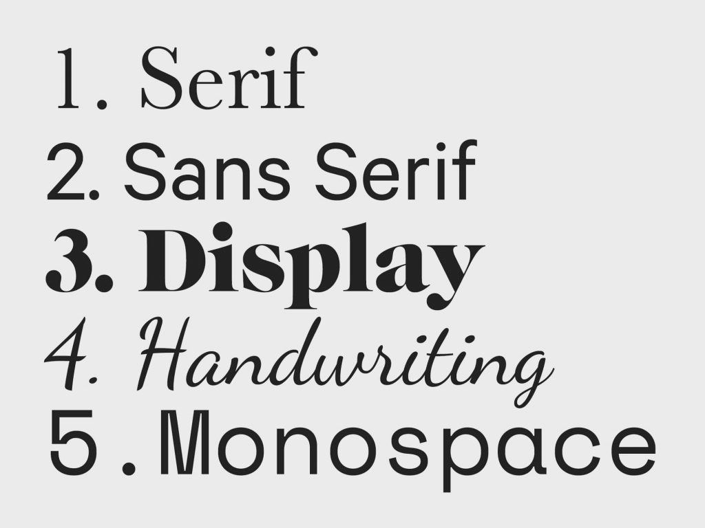
When you are designing you will notice that there are different ‘styles’ or categories of fonts. Each category has its own visual characteristic and is associated with different scenarios. Here are some of the different categories of fonts that you will see on Google Fonts.
- Serifs
- Sans Serif
- Display
- Handwriting
- Monospace
Serif
Serif is the word used to describe the line or stroke attached to the ends of letters in a certain font. Serif is also used to describe an entire font that makes use of serifs. Some popular serif fonts include Caslon, Garamond, Baskerville, Times New Roman, and Mrs. Eaves.
Sans Serif
The word ‘sans’ means without therefore sans serif is a font that does not include a serif at the end of each letter in a font. San-serif fonts are also known to have less variety and width variation in the letterforms than serif fonts. Popular sans serif fonts include Arial, Helvetica, Futura, Avant Garde, and Gotham.
Display
A display font is a font that is intended for use at large sizes because it may include details that would get lost at smaller sizes. These are also meant to be used for short headings rather than long extended bodies of text. Popular display fonts include Cooper Black, ITC Benguiat, Caslon Antique, Papyrus, and Windsor.
Handwriting
In full transparency this is a category on google fonts that I shy away from. Handwriting fonts are meant to emulate the aesthetic and strokes of physical handwritten letters. Popular handwritten fonts include Comic Sans, Market Felt, and Lemonade.
Monospace
Monospace fonts are fonts whose letters and characters each occupy the same amount of horizontal space. Monospaced fonts were widely used in early computers which often had extremely limited graphics capabilities and unpredictable space limitations. Popular monospaced fonts include Courier New, Lucida Console, Monaco, and Inconsolata.
How to Download Fonts from Google Fonts
Using free fonts from Google fonts is an easy 3 step process. When visiting Google fonts there are two ways you can use and implement the fonts for your designs. The first use is for implementation on a website which involves inserting some code into your html files. The second use and the one we will be focusing on is downloading the fonts onto the desktop of your computer and installing the font using the system provided software.
Step 1 – Select Your Font
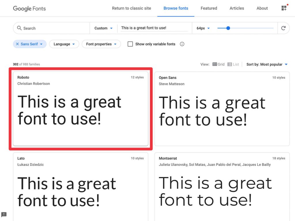
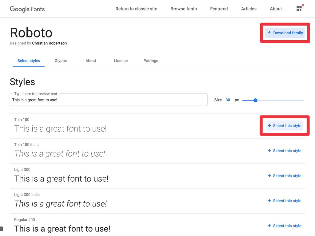
Select the font that you would like to use by clicking into the individual page. On the font page you will see the option to ‘Select this style’ or ‘Download family’. ‘Select this style’ will add that individual font weight to your collection. ‘Download family’ will add the entire font-family to your collection. Click either of these buttons.
Step 2 – Download Your Font
Once you have added the selected font to your collection, it will then open up a side drawer within the browser. At the bottom of the drawer there will be a button to ‘Download family’. Click that and it should open up a save dialog within the window. Save it to your desktop or folder so you can begin installing.
Step 3 – Install Your Font
After you have saved your font to your desktop or a selected folder you should now have a zipped file. Double click that file to unzip it and reveal your font files. You should be able to double click each of those files and have them automatically install onto your computer using the provided system application. Once that is done you should now be able to use the font in your editing software.
Now that you know how to use Google Fonts and install them onto your computer. In the next few sections I’ll cover my five favorite fonts in each category that I think every graphic designer should know and master.
Favorite Serifs
Merriweather
Merriweather was designed to be a text font that is perfect for reading screens and digital devices. The project is led by Sorkin Type which is a type design foundry based in Wester Massachusetts.
Lora
Lora is a balanced serif inspired by calligraphy. It does not have too much contrast and is also perfect for large bodies of text. I have personally used this font for website and book projects.
Robot Slab
Roboto Slab is described to have a robotic and geometric structure. It has thicker slab serifs and does not show a lot of variation in it’s characters. One of the reasons I enjoy this font so much is that it offers a variety of different weights that can solve for all kinds of briefs.
Source Serif Pro
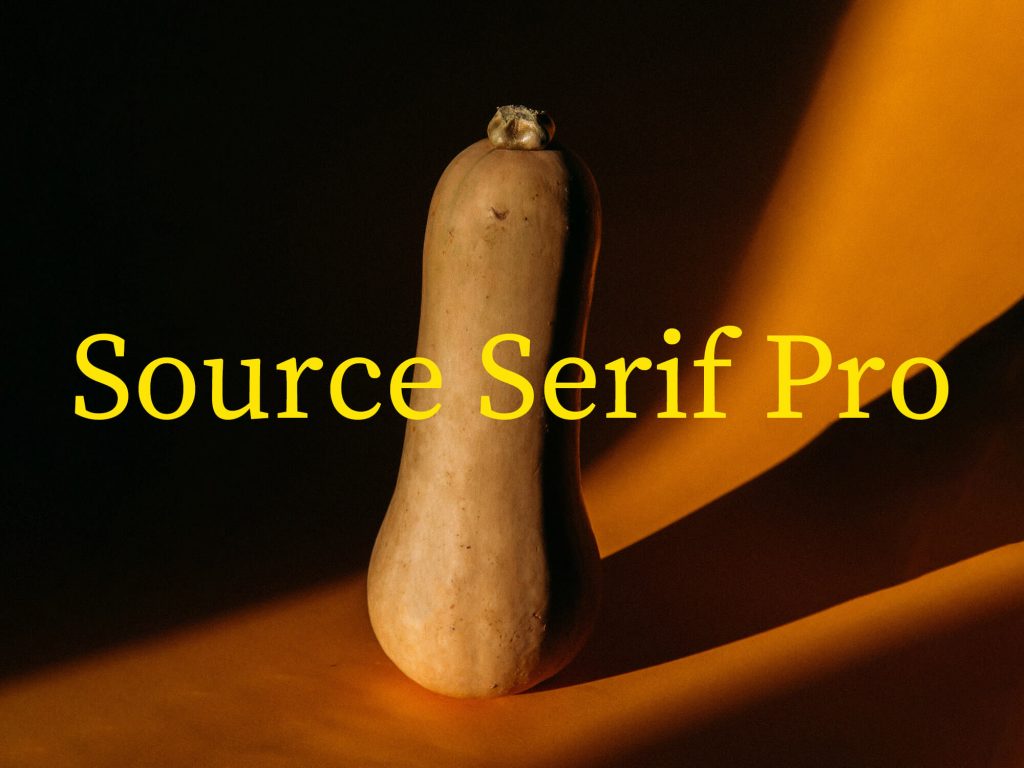
While Source Serif Pro does not offer as many font weights as Roboto Slab, it is a font that is very legible and does a lot of work with the weights provided. I also love the contrast and variation in the letterforms of Source Serif Pro.
DM Serif Text
DM Serif Text is my favorite of the five serif fonts. This weight is intended to be used for smaller sub-headings and text sizes. It also happens to be produced by one of my favorite type foundries called Colophon.
Favorite San Serifs
DM Sans
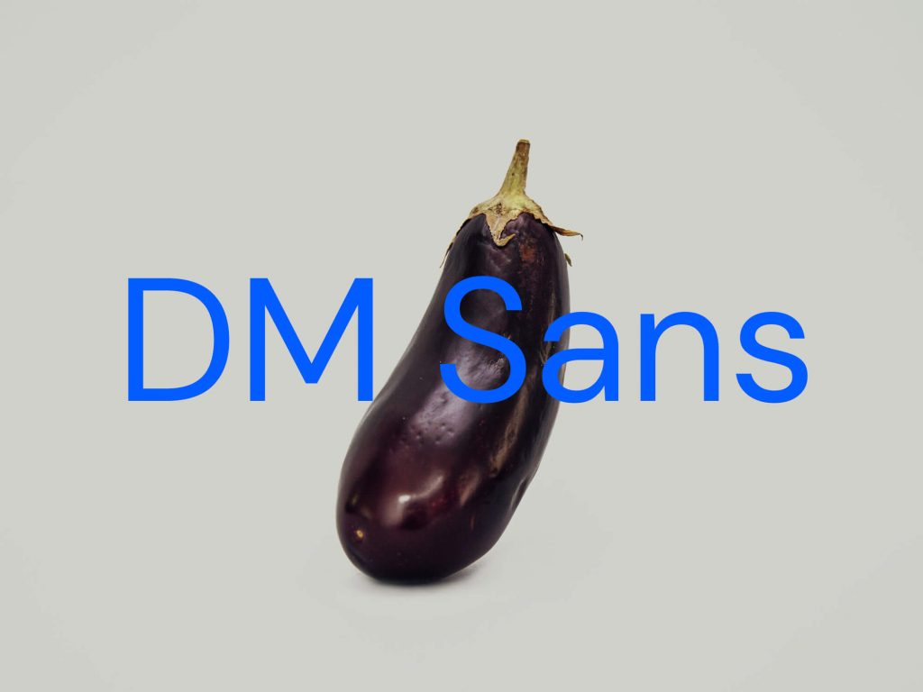
Continuing from DM Serif Text, DM Sans is the geometric sans serif designed sibling. Perfect for use at small text sizes, DM Sans supports a wide set of characters.
Open Sans
Open Sans is a sans serif designed by Steve Matteson. It contains over 897 characters and has been optimized for print and digital projects. It has a number of different weights and is approachable and very legible.
Roboto
It’s no coincidence that Roboto is both a favorite serif and sans serif font. It is just so versatile and works in almost any situation. Definitely a powerhouse font that every design should get to know and not forget.
Montserrat
Montserrat is probably one of the most popular fonts in the world and for good reason. It contains a ton of different font-weights and it is just so familiar. The font was inspired by the signage and posters in the Montserrat neighborhood of Buenos Aires.
IBM Plex Sans
IBM Plex Sans is a unique sans serif font that was created to capture IBM’s rich history and to illustrate the unique relationship between mankind and machine. Because of this the font has excellent legibility for print and digital based projects.
Favorite Display
Bebas Neue
Bebas Neue is a narrow sans serif font perfect for headlines, captions, and packaging that will surely grab viewers attention. Although it only has one font-weight, that is all you will need.
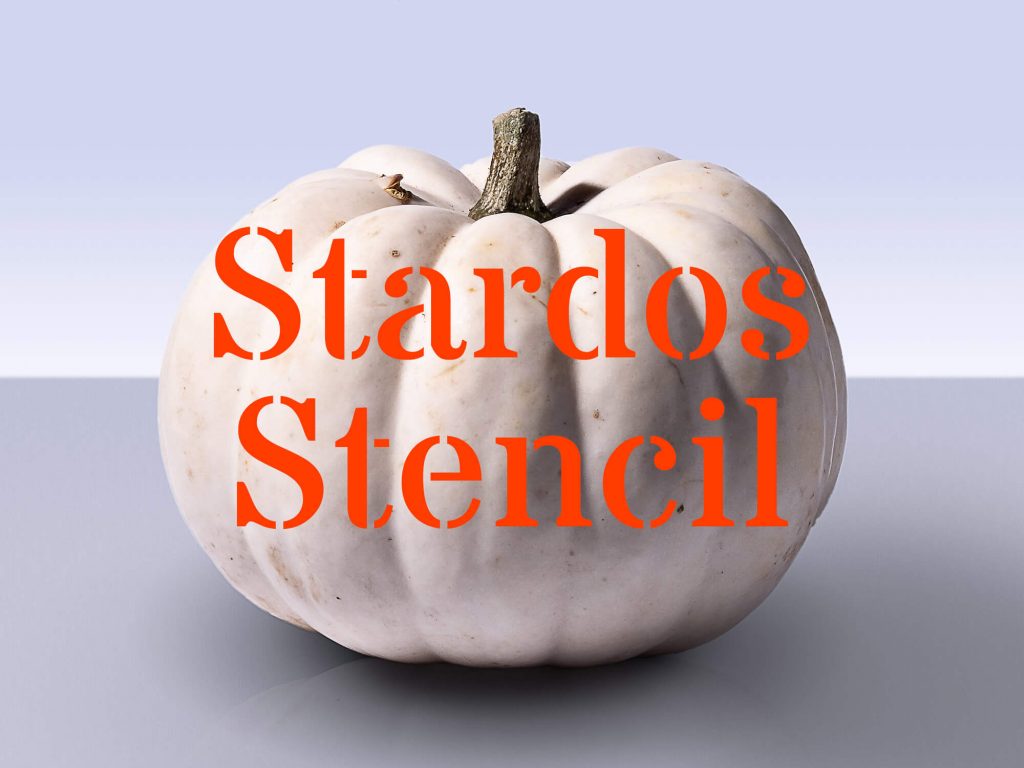
Stardos Stencil
I think it’s always good to have a stencil font in your repertoire and Stardos Stencil should be that font. It comes in regular and bold because let’s be honest here. This is display font and if you have even the slightest idea of using this for anything else then we aren’t friends.
Poppins
Poppins is a popular sans serif font and I see it being used more and more in all kinds of projects. However I think the beauty in Poppins is the contrast and variation in its letterforms even though it is a geometric sans serif. For that reason it is a shame to use it at smaller sizes where those beautiful details would get lost.
Playfair Display
Playfair Display is a gorgeous serif font that captures the beauty and elegance of traditional ink pens. It has beautiful thin elements as well as wider variations in its characters that really show how sophisticated it can be.
DM Serif Display
DM Serif Display is obviously part of the DM font family that I have already said enough about so you should probably just get to know it already.
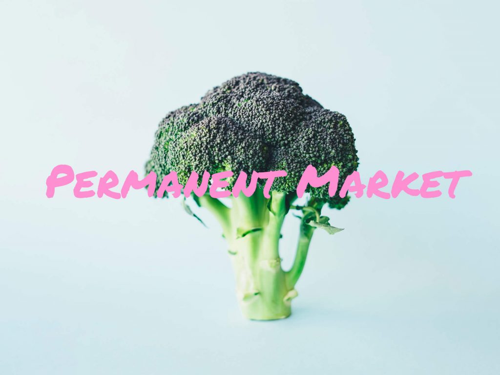
Favorite Handwriting
I’m going to keep my notes about these fonts short and brief as I don’t use any handwritten font regularly in my design projects. My perspective on handwritten fonts is that they have a time and place that is rather specific for when you should use them. I also believe that a handwritten font should never be the focus of your project but rather an accent if needed. If you want a handwritten font to be the focus on your design then you should either create it yourself or collaborate with someone that is an expert in handwritten typography.
Favorite Monospace
Roboto Mono
Roboto Mono is a wonderful addition to the already robust Roboto family of fonts. Some monospaced fonts can feel quite clunky and imperfect when attempting to read larger bodies of text but Roboto Mono does not.
Space Mono
Space Mono is another font designed by my favorite type foundry, Colophon. It is a font developed for headlines and display use-cases. It was inspired by the headline typefaces of the 1960s which were adopted by science fiction films, television, and literature.
Inconsolata
Inconsolata is not your stereotypical ‘programmer font’. It is designed for printed code listings as well as larger editorial headlines at high resolution. The font was partly inspired by the monospace font Consolas that was used for Microsoft Vista.
Source Code Pro
Source Code Pro is a monospaced compliment to the Source font family. Designed with coding applications in mind, this font family comes with additional weights all the way up to Black.
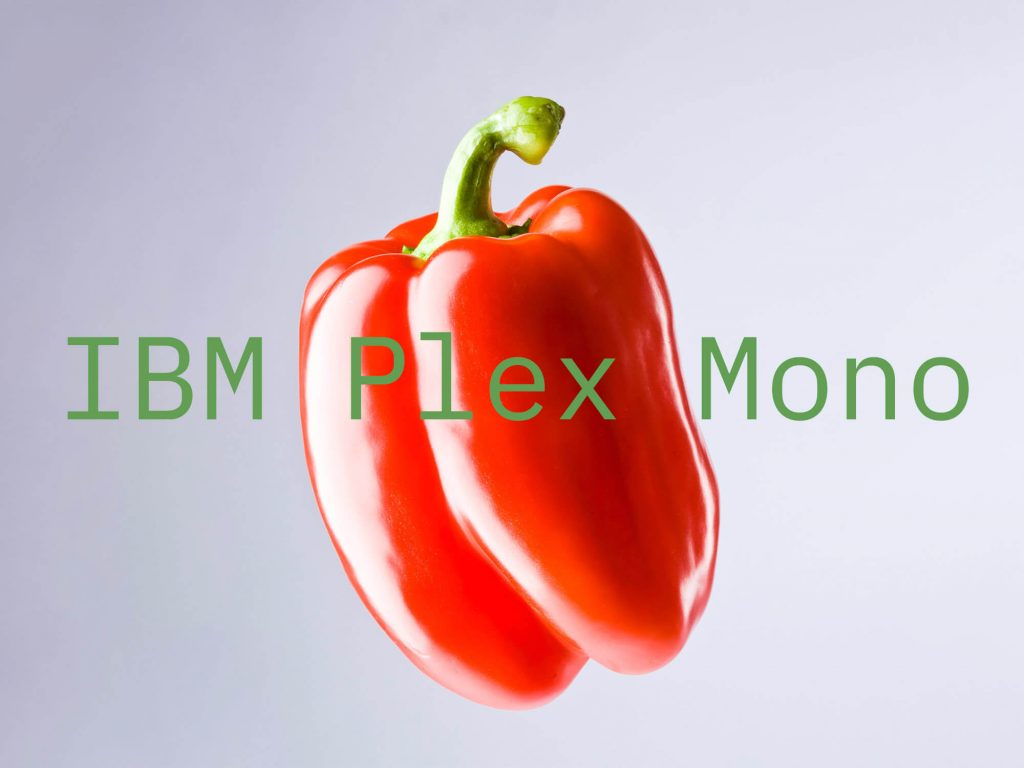
IBM Plex Mono
IBM Plex Mono is another great addition to an already robust and utilitarian font family. Don’t be afraid to venture on your own and use any of the IBM Plex fonts as they are all equally wonderful to use and design with.
Conclusion
I hope I’ve peaked your interest and you’ve found some new favorite fonts to use in your next graphic design project. I’ve also put together this free font pairing cheat sheet to help you get up and running quickly with new font combinations. Sign up using this link and I’ll send you the free font pairing cheat sheet.


